
Iron Bru › Forums › Blast Furnace › New shirts
- This topic has 102 replies, 25 voices, and was last updated 3 weeks, 3 days ago by
Ex Officio.
-
AuthorPosts
-
July 8, 2026 at 12:39 pm #322834
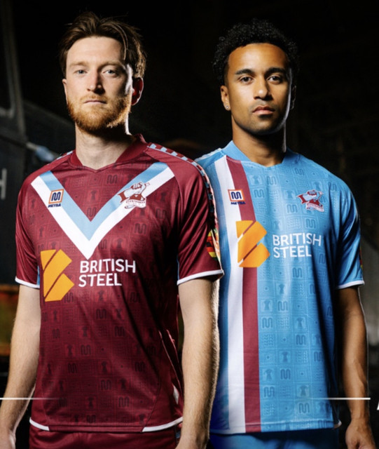
I quite like the design of the away shirt,l, should be home The home shirt is bad,the way the badge spills over the V edges looks sloppy and distracts .I assume the shirt is an off the shelf design so somebody must surely have thought shrink the badge to fit .
I don’t wear them so my tuppence is worthless anyway.
I find it amusing they once again use the lawyer,a reminder to today’s not so cool kids what they never hadCompletely agree with the stuff about today’s not so cool kids.
Funny how the Honest Lawyer has become really desirable – and even funnier that it is actually United central, co-opted for use by the club. The original roots of the Lawyer and United are that it was the weekend drinking home of the often critical Get A Grip Ref fanzine mob (who had their run-ins with the club). Later, of course, it was handed down to the original pre-corporate Flag Day mob.
The exterior of the Lawyer looks tremendous in the video, too, as an aside.
July 8, 2026 at 12:47 pm #322836I quite like the design of the away shirt,l, should be home The home shirt is bad,the way the badge spills over the V edges looks sloppy and distracts .I assume the shirt is an off the shelf design so somebody must surely have thought shrink the badge to fit .
I don’t wear them so my tuppence is worthless anyway.Wrong, it’s not worthless. You’re allowed to have an opinion even if you don’t wear the shirts. In fact, doesn’t not wearing the shirts constitute an opinion on them, of sorts?
July 8, 2026 at 1:05 pm #322837I guess so, aesthetic design is pretty subjective but I just hate the dump on a badge without thought attitude,bit like the chains on last season’s abomination.
July 8, 2026 at 1:16 pm #322838I guess so, aesthetic design is pretty subjective but I just hate the dump on a badge without thought attitude,bit like the chains on last season’s abomination.
It’s subjective after the point of basic principle.
And the badge thing is just one of a few ignorant or careless mistakes.
July 8, 2026 at 1:31 pm #322842If it’s the details that’s annoying people then it’ll be fine when you’re viewing them from the top tier of the Emirates Stadium.
July 8, 2026 at 1:43 pm #322843If it’s the details that’s annoying people then it’ll be fine when you’re viewing them from the top tier of the Emirates Stadium.
Even that won’t be far enough to escape eye damage.
July 8, 2026 at 2:27 pm #322854I referenced somewhere that John Staff once stopped me to say the claret on my 1950s replica shirt was incorrect. But I certainly wasn’t slagging him off. I respected and admired his knowledge and the fact he cared about these things.
1 user thanked author for this post.
July 8, 2026 at 2:36 pm #322855If it’s the details that’s annoying people then it’ll be fine when you’re viewing them from the top tier of the Emirates Stadium.
Or Teletext
July 8, 2026 at 3:09 pm #322856I’ve just had another look. Could that “chevron” in fact be an arrowhead pointing to the sponsors logo? Great marketing!
Need contrasting shorts with home kit, all claret no good.July 8, 2026 at 3:25 pm #322859‘Someone (on here or the Facebook cult page) once slagged John Staff off because he knew the exact ‘pantone numbers’’
I think I asked what the number was in reply to Saleiron. I asked out of curiosity and genuine interest though it did amuse me. I would never slag off John Staff either. Huge respect for him and bought several of his books. In fact I don’t recall anyone on here slagging him off so this is either a misunderstanding or perhaps happened on another site.
1 user thanked author for this post.
July 8, 2026 at 3:30 pm #322861I’ve just had another look. Could that “chevron” in fact be an arrowhead pointing to the sponsors logo? Great marketing!
Need contrasting shorts with home kit, all claret no good.It’s pointing at the one pack that makes nearly all people who wear them look ridiculous
2 users thanked author for this post.
July 8, 2026 at 3:41 pm #322865Deery said:
I think I asked what the number was in reply to Saleiron. I asked out of curiosity and genuine interest though it did amuse me. I would never slag off John Staff either. Huge respect for him and bought several of his books. In fact I don’t recall anyone on here slagging him off so this is either a misunderstanding or perhaps happened on another site.
There was a few turned on him after he was briefly banned from selling his Raw chickens.
A certain self publicist behind that I think?
1 user thanked author for this post.
July 8, 2026 at 4:17 pm #322872Love em both, can’t wait to wear em in Garbo’s, Tiffs and Moments.
1 user thanked author for this post.
July 8, 2026 at 4:51 pm #322876I referenced somewhere that John Staff once stopped me to say the claret on my 1950s replica shirt was incorrect. But I certainly wasn’t slagging him off. I respected and admired his knowledge and the fact he cared about these things.
Point taken! Good lad.
July 8, 2026 at 4:52 pm #322877‘Someone (on here or the Facebook cult page) once slagged John Staff off because he knew the exact ‘pantone numbers’’
I think I asked what the number was in reply to Saleiron. I asked out of curiosity and genuine interest though it did amuse me. I would never slag off John Staff either. Huge respect for him and bought several of his books. In fact I don’t recall anyone on here slagging him off so this is either a misunderstanding or perhaps happened on another site.
It’s definitely a misunderstanding, I remembered the comment incorrectly. However, my actual point, about consistency of the club colours, still stands.
July 11, 2026 at 2:48 am #322968Absolutely horrible kits .. poor design cheap n nasty.
There were some suggested images on the SFCFFB page about 3 weeks ago that were excellent yet this is what we got .. please dont bother with a third kit if this is the standard.
Sales might possibly be lower than normal but last years kit was pretty bad and still sold well so who knows… its a fact i wont be having one sent out this year.
I was under the impression fans would have a vote or a say in the kits but appears not, they are only thrown a bone when the club is after rifling the pockets.1 user thanked author for this post.
July 11, 2026 at 9:09 am #322971Bearing in mind that last year’s third shirt sold out so quickly, they maybe should have considered keeping it the same with the new sponsor on it.
July 11, 2026 at 9:20 am #322975Club couldn’t go far wrong in going for the kit images from the Facebook page for next season, that would be nice and early and would save my rinse and repeat thread been aired.
The working with the fans was not a vote but more on the launch but still never happened, much more of that and Vof should be looking at themselves and their role and whether it’s just going to be one sided and them looking like patsies.1 user thanked author for this post.
July 11, 2026 at 11:16 am #3229781 user thanked author for this post.
July 11, 2026 at 12:29 pm #322982As I don’t buy replica shirts, I am not too pernicketty about the design. The club colours are claret and light blue and this Home shirt that contains both these colours I’m happy with. As for the logos, well they generate cash from sponsors, which for me is better than some of the schemes the club has come up with to remove money from my wallet!
July 11, 2026 at 6:33 pm #3230013rd shirt is best of the 3
1 user thanked author for this post.
July 11, 2026 at 6:59 pm #323003personally i think the new kits are utter gash and would not have one given as would not wear it.. especially the home kit as having the V design it would enhance my man boobs.
Please no third kit it might be worse ..July 22, 2026 at 9:10 pm #323332Our new replica kits were due to have arrived and be on sale by the end of last week. A cursory bit of research reveals that most NL clubs have theirs released and on sale. Assuming that it is an important and major source of revenue to the club, it’s not good enough. Fans weren’t consulted on design because of the imperative to get kits on sale at an early point.
July 22, 2026 at 9:29 pm #323334Lol.
July 23, 2026 at 3:30 am #323336My mate in Leeds usually gets me a Scunny shirt and either brings it out or sends it here , chatting last night he asked me what size i wanted and i replied .. not this season mate im not at all keen on this years monstrosity…that will be 2 seasons on the trot as i did not bother with last seasons as also thought it was naff.
July 23, 2026 at 5:03 am #323337Thunderbirds Are No!
Thunderbirds Are No!
July 23, 2026 at 9:23 am #323338Our new replica kits were due to have arrived and be on sale by the end of last week. A cursory bit of research reveals that most NL clubs have theirs released and on sale. Assuming that it is an important and major source of revenue to the club, it’s not good enough. Fans weren’t consulted on design because of the imperative to get kits on sale at an early point.
Meyba appear to have been utter garbage on all fronts since SUFC went with them. I am positive the club will bin them off when contractually able.
1 user thanked author for this post.
July 23, 2026 at 10:09 am #323341Have we ever had a supplier with which the club and fans were happy? I see that Hartlepool’s Meyba manufactured kits are available and on sale. What have they done differently?
1 user thanked author for this post.
July 23, 2026 at 10:18 am #323343Ordered them earlier?
July 23, 2026 at 10:33 am #323344Have we ever had a supplier with which the club and fans were happy? I see that Hartlepool’s Meyba manufactured kits are available and on sale. What have they done differently?
In the recent past the club sang Kelme’s praises, and the company certainly gave the club some financial leeway during uncertain times. They also produced by far the best kit (24/25) in recent memory.
-
AuthorPosts


- You must be logged in to reply to this topic.